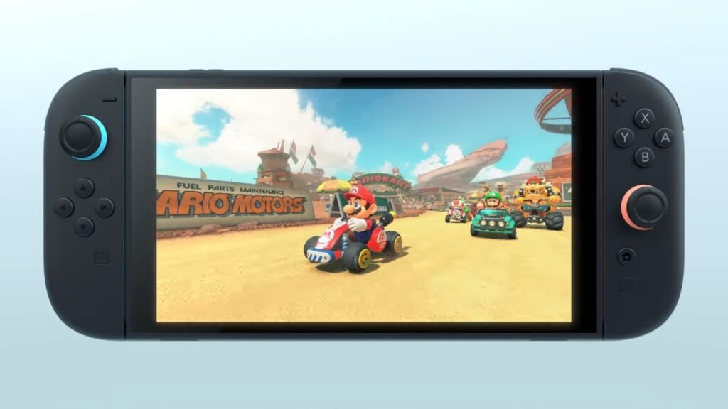
Nintendo‘s new golden goose has hatched, and we’ve gotten our first real look at the Switch 2. It appears to feature numerous small but important QoL changes to make gaming more pleasant no matter how you play. That’s not even touching on the new hardware and software capabilities that will hopefully usher in another great generation of games. As a journalist, gamer, and lifelong fan of whatever the plumber and Pikachu are up to, I’m always rooting for Nintendo. That said, something bugs me about Switch 2’s design, though the company keeps many details close to its chest. Let’s talk about color, marketing, and console cosmetics.
Does Switch 2 Resemble Old Handhelds Too Much?
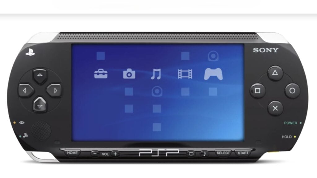
Nintendo has played with bold designs before, but the Switch 2 arguably plays it too safe with its basic layout and colors. The Switch’s iconic blues and reds, in particular, are dialed back. At a glance, it feels like the PSP and its many imitators. That said, I have zero doubt there will be a legion of alternate color schemes and licensed editions, and even the basic black version will surely sell. My favorite childhood Christmas was a blur of Mario Kart 64 and Diddy Kong Racing. If the awkward trident design of the N64 controller didn’t stop me and a legion of other kids from gaming, boring black Joy-Cons wouldn’t either. Marketing the original Switch with a more mature look worked once, after all.
Bad marketing can ruin a product, but that’s not what this is. Nintendo earned its brand recognition not only by making great games but also by identifying ways it could make those products more attractive. The low-key Switch 2 designs in our first look at the system feel like the launchpad for more colorful editions and licensed tie-ins. To use Fortnite as an example, it feels like Nintendo is relying on the power of FOMO. It knows many of us won’t rock a default Jonesy skin when we could be playing as Darth Vader or Hatsune Miku instead. As long as Nintendo’s big IPs deliver, though, the fun will be back in black.

