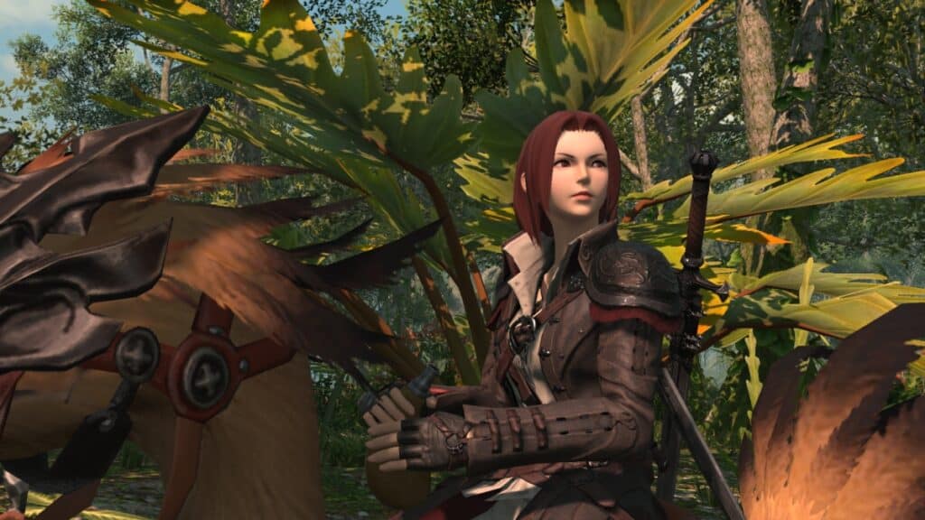
For the unaware, Square Enix tends to release a benchmark for every new FFXIV expansion, and Dawntrail isn’t an exception. This is a great way to see how your rig will hold up in the new content. Furthermore, you can look at your character with the new gear, get a glimpse of new locations, and more. However, the initial release of the most recent benchmark wasn’t ideal for many. Lighting issues, scary-looking faces on some of the cutest races, and more. But thanks to that feedback, Yoshi-P and his team released a new iteration, and fans couldn’t be happier.
After diving into the game’s official subreddit, many Warriors of Light are finally happy with the recent benchmark results, paving a brighter way for FFXIV: Dawntrail. Personally, I didn’t mind the first version’s issues too much at first. However, I noticed how my character’s neck wasn’t distinguishable enough due to the strange lighting effects. Now, it feels like night and day. And if modding Skyrim has taught me anything, it is that a minuscule change in lighting can make a big difference in a game.
Still, there are a few players who feel some races got the short end of the stick. Some Au Ra and Elezen players still report a few inconsistencies with certain faces, but overall, the feedback seems much better. Also, the fact that developers went and changed everything a few weeks away from the expansion’s release is fantastic, which only shows their commitment to the upcoming adventure.
Overall, this seems like a step in the right direction for future graphical updates. If you didn’t know, the benchmark shows the first of many visual improvements coming to FFXIV: Dawntrail and beyond. If you ask me, it is the perfect time. Endwalker marked the end of an era, not only in the story but in the game’s image and feeling. With Square Enix aiming for a new narrative and a fresh-like feel in Dawntrail, we can’t wait to see how this decade-old MMO evolves into something more ‘next-gen’ in the upcoming years.

