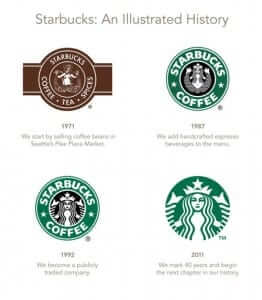
In the past week or so, two giants of the tech world decided to change their logos. The changes were subtle. They were nuanced. I’m sure they were heavily researched and their impact painstakingly tested on focus groups. One does not just change the most recognizable part of a company’s image haphazardly. Remember back when Starbucks changed their iconic logo and dropped the words “Starbucks Coffee” in favor of an image of the twin-tailed siren with no wording? It took a lot of people by surprise and it took them a while to accept the new change.

A company changing its logo is certainly not out of the ordinary. It happens all the time. Hell, Apple has changed its logo a handful of times over the life of the company. A lot of times a change in the way a company presents itself to the public reflects a change in the way they want the public to perceive them. As anyone in the advertising industry can surely attest, the people who help design these logos and craft the public relations campaigns to introduce them to the public are usually well respected and well compensated.
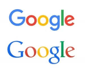
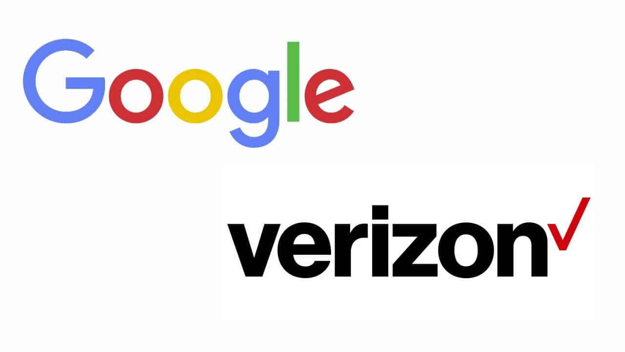
So fast forward to today. Both Google and Verizon have made subtle changes to their logos.

But the question still remains: Why? Google commented on its own blog about why they felt like it was needed. Via The Verge:
“It doesn’t really settle on a specific reason that a redesign was needed, but it says that this logo should better reflect the reality that Google is no longer a site you visit on a desktop computer — it’s a huge collection of sites, apps, and services that you visit on PCs, Chromebooks, smartphones, and anywhere you can find a web browser.”
Verizon said essentially the same thing, but with more detail.
“At its most basic level, the new logo is a visual statement that honors our history and reflects an identity that stands for simplicity, honesty and joy in a category rife with confusion, disclaimers and frustration. It’s a cleaner, more human design and the checkmark, the universal symbol for getting things done, uniquely expresses the reliability of Verizon.”
How about that for saying something without actually saying something? Why are you changing your logo? Because we want people to know we get things done! Okay…
In reality, I believe both of these companies are changing their marketing focus. They are taking a concentrated shot at courting millennials. Not that Generation Y isn’t using both Google and Verizon. They are certainly some of the biggest dogs in the tech world. I’m sure they’d like to stay that way. There have been studies that millennials gravitate toward simplicity and a minimalist culture. Hipster chic is in, and it will be for the foreseeable future. Millennial consumers don’t want to contribute to the continued domination companies like Google and Verizon. They want to help out the smaller mom and pop organizations. That’s one of the reasons people flock to crowdsourcing sites like Kickstarter and GoFundMe. They don’t want to support the man.
It’s the 60s all over again.
So yes, these are calculated moves on both Google and Verizon’s parts. They are attempting to appear smaller, more simplistic. They’re trying to trick millennials into coming back to the fold. They’re saying, “We’re not the corporate giants you think we are. We have more in common with the little small business start-up than we do with big oil.” And my guess? Millennials will eat it up. We might be the most tech savvy generation out there, but we’re definitely not the most clever. That’s the problem: Hubris.
We’ll get bamboozled by these new trick, and we won’t even know it. Everything is shiny and new at Verizon and Google! There’s no reason to look at whatever that new company is making. We probably do it better anyway. Don’t you trust us?


